Theme Editor
The theme editor is used to customize the look and feel of the application. To access the theme editor, navigate to the left menu and click the Theme Editor tab.
On the next page, it is possible to select an already existing theme, delete, or create a new one.
Click on the plus sign to create a new theme. On the Add theme window, input the name of the and click the Create button. There is also the Clone function to replicate an already existing theme.
On the left side of the theme editor’s menu bar are the Save and Help buttons. The breadcrumb trail used to navigate the builder is located on the right side of the menu bar.
The theme editor is divided into two sections - the Left panel and the Canvas. The right side of the canvas holds the preview window, and the left side holds the properties window where all the changes are made. Within the properties window, it is possible to change the color of texts, background color, padding, font size, margin, and border-color depending on the element you are customizing. These properties are applied to the element in different states:
- Regular: This is the normal state of the element
- Hover: when the mouse is moved over the element
- Active: when the element is focused
- Enabled: when the element is enabled
- Disabled: when the element is disabled
Note that it is possible to customize how the element looks and behaves in each of those states. To change the state, click on the downward arrow on the right side of the properties window, then select the one to customize.
Body
The Body refers to everything on the builder i.e. Header, Logo, and Left menu and elements in the canvas.
- Color affects the color of all the texts in the builder that have not already been set in their respective sections.
- Background-color affects the background of the main view panel of the browser.
- Padding will decrease or increase the size of the app window from all sides with respect to the border of the browser’s main view panel
- Font-size will change the size of the texts in the builder that have not yet been set in their respective sections.
Header

The Header refers to everything on the header including the Logo. Click on the right arrow next to the option to expand it. There are two elements that can be customized - the Header and Logo:
Header
- Color affects the color of the texts and icons on the header
- Background-color affects the background color of the header
- Padding affects the distance between the elements on the header and the borders of the header
- Font-size affects the size of elements in the header
Logo
- Color affects the color of the logo
- Background-color affects the background color of the logo area
Left menu

The left menu refers to the menu on the left side of the screen. To customize this menu, click on the right arrow to expand it. There are two elements that can be customized - the Menu and Menu items:
Menu
- Background-color affects the background color of the header
- Padding affects the distance between the elements on the menu and the borders of the menu
- Font-size affects the size of elements on the left menu
Menu items
- Color affects the color of the icons and texts on the menu
- Background-color affects the background color of the menu items
Right menu

The right menu refers to the menu that appears when the gear icon at the far-right corner of the app is clicked.
- Color affects the color of the texts and icons on the right menu
- Background-color affects the background color of the right menu
- Padding affects the distance between the elements on the menu and the borders of the menu
- Font-size affects the size of elements on the menu
Buttons

Buttons refer to all the buttons that can be added to the webpage. There are 6 styles of buttons that can be used - Warning, Danger, Success, Primary, Info, and Link. Properties of the buttons such as the color of the text, background-color, padding, margin, and border-color can be customized. So, every time a button is added to the webpage, it is put under one of the 6 styles that can later be changed in the properties section of the webpage editor.
Group Boxes

A Group box is a container that holds other UI elements. There are 4 styles of group boxes - Success, Danger, Warning, and Primary. Properties of the group boxes such as the color of the text, background-color, and border-color can be customized. When a group box is added to the webpage, it is put under one of the 4 categories that can later be changed in the properties section of the webpage editor.
Widgets
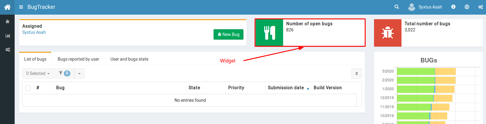
Widget is a custom element with an icon. There are 4 styles of widgets that can be used - Aqua, Yellow, Green, and Red. It is possible to customize the icon and background color of the widget from the properties window.
Tab
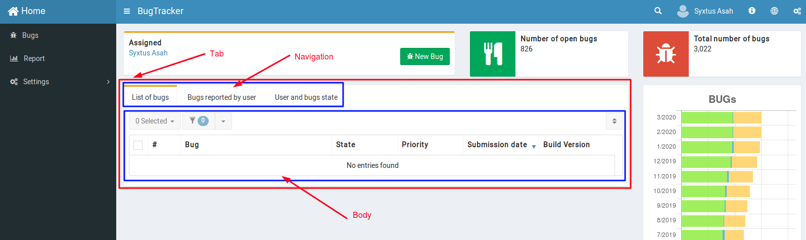
Tab refers to tabbed containers that hold other UI elements. It is made up of two parts - Navigation bar and Body. For Navigation, the color of texts, background-color, and border-color can be customized. For the Body, the color of texts and background-color can be customized.
Field

Field refers to the area where texts are added. Here, the color of the field name and background-color of the field can be customized.
Select

Select is a type of field where users can choose different options from a dropdown menu. Here, it is possible to customize the field name and background color.
Custom CSS
The theme editor also allows users to add custom CSS. With this, users can customize UI/UX elements using their own custom code.
Applying the Theme
Once the customization is done, click on the Save button to save the changes. Now, the theme is ready to be applied to the webpages and applications that have been built. To apply the themes to applications, go App settings and select the desired theme from the CSS Theme dropdown menu.
Also, to apply a theme to a webpage, navigate to the webpage in the builder, then click on the gear icon at the center of the menu bar. In the Web page properties window, select the desired theme from the CSS Theme dropdown menu.